Every new WordPress website created on ACC’s WordPress network comes pre-installed with the ACC Default WordPress theme. The following sections outline the theme’s features and technical background.
If you are new to WordPress please review WordPress Training for Content Managers at ACC.
Built on the Skeleton WP Theme
The ACC Default WordPress theme is built using the Skeleton theme from SimpleThemes. Skeleton is a Responsive Web Design (RWD) theme based on the Skeleton boilerplate. Many of the features that are available to the Skeleton theme are carried over into the ACC Default WordPress theme.
Base Theme Features
The following is a list of features that are carried over from the Skeleton base theme.
- Columns (up to 6!)
- Buttons
- Tabs
- Toggle Panels
- Callout Boxes
Base Theme Feature Examples
Columns
Copy and paste the following into a shortcode block:
[one_third]
Column One - Add anything you want here
[/one_third]

[one_third]
Column Two - Add anything you want here
[/one_third]

[one_third_last]
Column Three - Add anything you want here
[/one_third_last]
Buttons
Buttons are inserted using the Custom HTML block. Styling is handled through the theme’s stylesheet.
Copy and paste the following into a Custom HTML block:
<button><a href="https://www.austincc.edu" target="blank">Sample Button</a></button>Tabs
- Tab 1 content
- Tab 2 content
- Tab 3 content
Copy and paste the following into a Shortcode block:
[tabgroup]
[tab title="Tab 1" id="t1"]Tab 1 content[/tab]
[tab title="Tab 2" id="t2"]Tab 2 content[/tab]
[tab title="Tab 3" id="t3"]Tab 3 content[/tab]
[/tabgroup]
Toggle Panels
Toggle Content One
Toggle Content Two
Toggle Content Three
Copy and paste the following into a Shortcode block:
[toggle title="Button text One"]
Toggle Content One
[/toggle]
[toggle title="Button Text Two"]
Toggle Content Two
[/toggle]
[toggle title="Button Text Three"]
Toggle Content Three
[/toggle]
Callout Box
Callout Box
This is callout box
Copy and paste the following into a Shortcode block:
[callout]
This is callout box
[/callout]
Update!
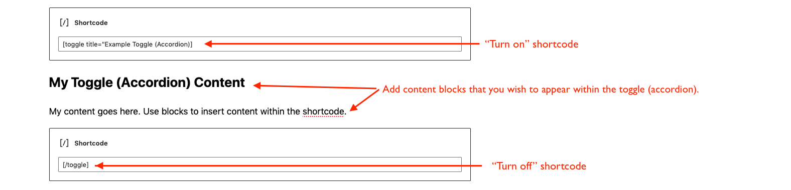
Utilizing the Gutenberg block editor the shortcodes above can be broken into individual blocks so users do not have to hard code HTML within the shortcodes themselves. The following is an example using the toggle (accordion) shortcode:
My Toggle (Accordion) Content
My content goes here. Use blocks to insert content within the shortcode.
The toggle (accordion) above looks like this in the Gutenberg editor:
Featured Image
The featured image display is available for pages but not for posts. Feel free to drop images into the body of your posts to highlight your posts content. Featured images are centered horizontally and vertically and are cropped to 1140px by 436px. Here is an example:
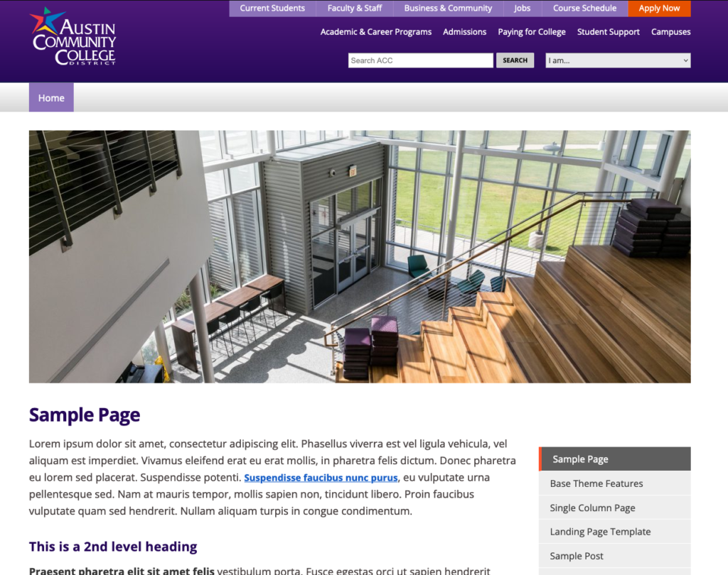
Featured Image
Tags: WordPress
Back to Top