Logo Usage for Signage or Merchandise
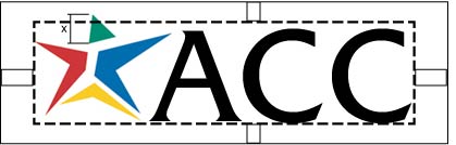
There are two alternatives (horizontal and vertical) to use the logo for signage or merchandising. The alternatives of the logo include both the star emblem and the initial capitals in the college’s name (ACC) in the typeface shown below. The two elements are inseparable and unalterable. The size of the logo can vary, but this must be done while maintaining the proportions between the logo’s star and type elements. No additional elements may be added.
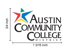
The size of the logo can vary, but you must maintain the proportions between the logo’s star and type elements. In any instance, the minimum size of the official logo can be no smaller than 3/4 inch by 1 3/16 inches (business card size), 3/4 inch by 5/8 inches (horizontal version) and 5/16 of an inch by 1 inch (vertical version).
The Office of College Relations & Marketing must approve these versions of the logo on a case-by-case basis.
Logo Usage for Print or Webpages
Sizing
Use the logos as displayed here. The logo should be no smaller than the business card logo size (3/4″ x 1-3/16″). The graphics inventory provides three sizes of the official logo in color and two sizes of the black and white version.
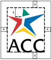
Spacing
When designing printed materials using the logo, leave leaving ample blank space around the logo. This is for optimum recognition and readability. No other graphic or typography should be placed proportionally closer to the logo than the height of the initial capitals in the “A” or “C” of college’s name.
The blank space around the alternative logos should be the the height of the green triangle of the star.
Logo Placement on Webpages
- The logo should always be in the correct color and size.
- The logo should always be on the first page of major categories/sites (e.g., LRS, academic departments).
- The logo should be linked link back to ACC Home Page.
- Never use the ACC logo or elements of it as a background or watermark .
Placement/Scale on a Printed Page
- Placement on a page: As a graphic element, the logo should be part of the overall design of a page, to readily identify the college. As such, it should typically appear at the top or bottom of a page.
- Scale: Use the logo in appropriate proportion to the rest of the design. Making it too small diminishes the ability to readily identify the college. A logo rendered too large is like shouting. Follow these guidelines:
- 4″ x 9″ trifold: logo should be about 2-1/2″ wide
- 8-1/2″ x 11″ single sheet: logo should be no more than 3-1/2″ wide
- 11″ x 17″ poster: logo should be no more than 4″ wide
Logo Colors for Four-color Printing
In printing language, “four-color process” refers to the use of tints/screen combinations of the four color inks used in offset lithography to create all other colors. The colors of the ACC logo, using four-color process, match four colors found in the Pantone Matching System (PMS), plus black. Those colors are:
Because printing presses, ink standards, and other related processes vary, please contact the Office of College Relations & Marketing if you plan to use the 4-color version of the logo.
Web Colors
The logo colors for webpages are based on the RGB color scheme and hexadecimal numbers. Please notify the Office of College Relations & Marketing if you plan to use the 4-color version of the logo.
| R (0-255) |
G (0-255) |
B (0-255) |
Hexadecimal | |
|---|---|---|---|---|
| Green | 000 | 160 | 143 | #00A08F |
| Red | 212 | 001 | 057 | #D40139 |
| Blue | 000 | 112 | 200 | #0070C8 |
| Yellow | 255 | 215 | 000 | #FFD700 |
| Black | 000 | 000 | 000 | #000000 |
Black and White
Often, color printing is not cost-effective or necessary. Many ACC internal communications are produced on a photocopier. In these instances, both the logo star and the type should be solid black. A grayscale version of the color version is not permissible.

Two Colors
In a two-color application, both the star and the type should be solid color.
- The preferred color for the ACC logo in a two-color document (i.e., black text with second accent color) is black.
- The second color choice is Pantone Blue 280.
- For other color choices, contact the Office of College Relations and Marketing.
Reverses
A reverse is when the logo is on a dark background, “reversing” the colors. Typically, all or some of the elements are white so they stand out against the darker background. If using a reverse of the ACC logo :
- The type should be white against a solid, dark background (i.e, black or dark blue), and the star should be in the official colors (following the PMS guidelines).
- Both the star and type should be white when reversing against a photograph.
- Avoid backgrounds with textures or mid-tones, and avoid choosing background colors that clash with the colors of the logo’s star.